Stayed With Conventions

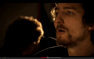
To stay with our conventions we included lip syncing of our artist, directly facing the camera,
singing our song. We wanted to create a connection between the artists and the fans so the best way to do this is by getting our artists to sing directly at the camera 'sight lines' so it draws the fans into our artists real emotion of the song and how our artists is feeling. This is Exhibitionism, it is where the artists is singing directly to the camera and wanting to been seen although Lady Gaga does it in a sexual and different way, she wants to appeal clearly to sexual attraction. Our artist is doing it in a slightly more mature way to create a clear connection between him and the audience, to make them feel more involved with the video and relate to pass experiences if they have any.

Frank Turner-Photosynthesis
http://www.youtube.com/watch?v=mQMVHhxTtLc

We were inspired by the black background so we decided to incorporate this convention within our music video. The connotations of having a black background, firstly shows our artists is isolated and alone therefore matching our lyrics of wanting to 'Hold' his girlfriend as he is alone. Musical Synesthesia is where we we associate what we hear with what we see and there are three different types 'Illustrating', 'Amplifying' and 'Disjunction' all written by the theorist Goodwin. This isn't direct illustration but we amplified our lyrics to show a performance alongside a narrative as from our audience research that is what our target audience wanted to see. Our target audience is E but are students with psychographics of Abc1, the more intelligent citizens of the society. We thought this would create our performance part of our music video which goes alongside with our narrative which we found in our audience research is exactly what they want to see, cross cutting between the two.
Frank Turner- Photosynthesis
http://www.youtube.com/watch?v=mQMVHhxTtLc

We liked the black and white effect that was used within 'The A Team' by Ed Sheeran so we developed this effect and included it but to show our artists having a flashback of his whole day. We did this because we want the fans to see that our artist is thinking a lot which means his girlfriend will be always be on his mind. The audience will be able to connect to this because they will have probably experienced this before. This is another way we can show off our technical skills and the audience would find this rewarding as they are the sort of audience that likes things that have been created through technology. We discovered our target audience like the use of some technology as they are intelligent individuals, we found this out when we did our audience research. So to offer something more we showed off our technical skills in the creation of our music video.

Ed Sheeeran- The A Team http://www.youtube.com/watch?v=UAWcs5H-qgQ

We used speeding up in our music video to show a performance and time passing which was used in 'The A Team' by Ed Sheeran but ours is showing our artists giving an actual performance unlike in 'The A Team' it is showing a girl finding it hard to find a place to live. We developed to try and show our fans that he is just passing time playing his guitar that he loves, hoping his girlfriend is going to arrive. We did it because our target audience are intelligent they like slow methodic things not up beat crash, bang, wallop. In other words they like the artist to be a real musician that can play. This further allows us to build on the creation of our star image.

Ed Sheeeran- The A Team http://www.youtube.com/watch?v=UAWcs5H-qgQ

We decided to go against the normally rough area and set our narrative in a nice up market area, as you can see by the mise en scene that is included, the old historical bridge with a nice river and wooded background. This is an up market rural area which you don't come across in a rough city. We did this to try and bring something fresh to the genre as our target audience is well educated students, we thought this would be a perfect way to give the latest in the genre. By that I mean keeping the key conventions of the indie acoustic genre but branching off slightly to make our video more exclusive and the latest thing to do in the genre. This also help to build up our star image which was written Richard Dyer who said a star is not human it is created by many aspects to get the audience to view the star in the right way.

Ed Sheeran- Lego House http://www.youtube.com/watch?v=c4BLVznuWnU

We decided to use a blur at the start of our music video to match the slow speed of our song instead of just having a normal start of someone messing around like they do in 'I still Believe' by Frank Turner or doing something silly. We started with a blur which then cuts into a performance by our artists to show the outline figure of him and then it comes in as the music starts. The connotations of this can mean he is a very serious performer and cares a lot about his music which our audience would admire. But our audience may believe our artist to be rather boring as he hasn't adopted the funny jokey attitude that is portrayed in similar products. You later in our music video discover that he's not boring. The blur was a very good choice as it shows a key use of modern technology.

Frank Turner- I Still Believe http://www.youtube.com/watch?v=sZ-D4jmkUiQ&ob=av2e
2. How effective is the combination of your main product and ancillary texts?
As said before we made some last minute changes to our inlays after some extra audience feedback, therefore the groups comments are below.
What we said in text format:
Here on the front cover you can see that our artist is sticking to the conventional dress code of the genre: acoustic indie. This is used in all three media texts that we have produced, in the inlays of the digipack the advert and the music video. We made sure that we kept to this convention in all of the media texts to make sure that the genre was maintained and recognisable.
The high-key lighting used on the front and back cover of the digipack is also used in the music video to help portray the artist in a positive light. It’s also a convention that’s used in two of the inlay pictures to maintain this star image of our artist. We used the high-key lighting in the pictures and shots in the video to create a more positive look to help create the star image that we wanted to portray of the artist being likable. This would help make him more marketable as the audience will develop a positive reaction towards him. This is also represented in his clothing style and the setting used on the digipack back cover and the music video, which show him in clothes that the target audience are likely to be able to see themselves wearing, and the setting is in a rural area, where most of the target audience live, creating a connection with the audience.
The sight lines of the artist used on the front and back cover of the digipack are directly looking into the camera. This is also a convention that we use in the music video when the artist is singing lyrics to the girl, which creates a connection with female members of the audience in particular, as they feel that this ‘fancyable’ guy is looking and singing about them, creating a connection with them.
In all of the inlay images we made sure that the artist’s sight lines were looking away from the camera and audience, for the opposite reason to why we used direct sight lines on the covers and in the video. We wanted to portray a feeling of innocence and vulnerability of the artist, this would attract more female members of our target audience into finding this artist attractive, and in turn would make the artist more marketable.
For two of the inlay images we wanted to show the audience a different angle of the artist. The two black and white images are both set in a more urban setting- the opposite to the rest of all of the media texts that we produced for this artist. We decided to use this convention because it sticks to the typical forms and conventions of the genre acoustic-indie, the poorer and rougher areas where the artists normally come from. We thought that it was necessary to use this convention because it’s what the audience have come to expect to see, but with our artist we wanted to be unique and different from other artists, so the majority of the things that the audience see of our artist is a rural, peaceful setting.
From our research we found that it was necessary for a guitar to be the main prop for the artist. That’s why we used it throughout the whole music video and on the front and back covers of the digipack. We discovered that this was the main prop used in the genre acoustic-indie, and if we didn’t use it very much then we wouldn’t be creating the correct star image for this genre. The guitar is iconic to this genre and we tried to make it iconic to our artist, so that the audience would immediately associate our artist with this genre.
On the advert we used the front cover of the digipack as the main subject of the poster. This would mean that the audience would immediately recognise the product, creating awareness of the artist and the conventions that they can expect to see in all media texts that he produces.


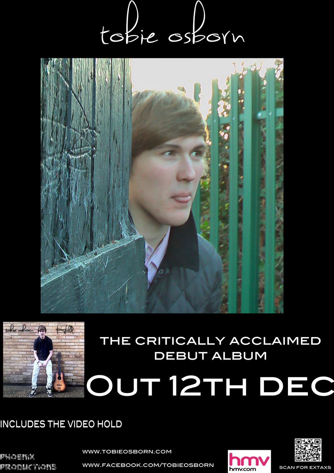
We changed are inlay pictures as they were not working in conjunction to match our video as well as they should be, by changing the inlay pictures this should create a better connection between our artist and our targert audience. We did the 3 spread inlay to show are artist's different movements and expressing a different feeling by the attitude and facial expressions. The fonts we used were the same one as we used on our front and back cover of the digipack 'sweetly broken' to stay conventional within our indie acoustic genre. We included our artist's name on the wall to create the image that he had just signed the wall. The fourth inlay picture we selected to use was the one with his tongue out to create a cheeky boy effect and this will help our artist having the likeability factor. We presented him in this way to construct his star image as nice, funny and an intelligent individual who people can relate to as a real life person. Not someone like Lady Gaga who is just so extreme with everything she does to gain audience appeal. The light is quite high-key light to match the rest of are digipack and it makes him look a bit more cheeky unlike if it was low-key light we wouldn't be able to create this effect. The use of colours we used are greens and grays as this is to try and hit the more male audience and we thought the inclusion of quite dark colours would help us to do this. The dress code is still in the genre but its saying he is comfortable but also likes to make himself quite presentable which is shown by the jacket as he is not wearing just sweats.
3. What have you learned from your audience feedback
Here is the answer to question three of the evaluation. The first video is of the rough cut that we made and then showed to the audience to get feedback. The second video is of the updated version, that we made changes to after receiving audience feedback.
Audience Feedback

Comments
Very good
Really good
Good miming
Good song
Needs more connection
More emphasise on them being a couple needed
Didn't see a storyline
It doesn't flow

Story good and clear
Very sweet
Good style
Clear song
Indie video
Lots of guitar
Tells a story
Concept and setting fits the genre
Guitar playing is bad
Good
Similar to others

Comments
Obvious mostly
A little
Some extent
Lyrics fit with what's shown
Good lyrics
Narrative works well
More close ups of 'Hold'
4. Are There Any Improvements We Could Make To Our Video?
Improve performance (mainly improve lip syncing) 13
No 3
Yes 2
Make narrative slightly clearer 2
Improve last shot
Improve the bedroom shot of our girl actor
Less repetition
Vary shots
Less variety
In a whole from our questions we got quite positive feedback about our music video but there are some clear areas that problems have been identified in and these parts have been improved. We were extremely pleased with the small amount of people that didn't think our visuals related to our lyrics and that most people thought our video met the expectations of an indie/acoustic video. Most people wanted to see more lip syncing so we re filmed as the bits that we have lip syncing in are slightly out of time and we gained great criticism from this. By re filming and improving the lip syncing scenes this has taken our music video to the next level.
4. How did you use media technologies in the construction and research, planning and evaluation stages?
http://www.youtube.com/user/misscatshoes#p/u/6/UmGRI3KwkjY
Things I may have only just touched upon or missed out:
The internet was extremely helpful as it offered many different website for us to instantly access and gain key informations for our audience research at the planning stage of our production. It allowed us to analysis similar products to our own, therefore this would allow us to see which key conventions we should include within our production. It was a quick and easy way to gain instant feedback via facebook from our fans and what they thought of our music video.
I forgot to mention Itunes which is a music program and I'm sure everyone has heard of it, it was good as it allowed us to import our song to it then play it back through Itunes as we planned our music video scene by scene. Later as it was an Itunes file we could just import and then drag it straight into Final Cut Express which made things very simple.
Final Cut Express offers a huge amount of features such as:
The ability to keyframe filters
Dynamic RT, which changes real-time setting on-the-fly
Motion path keyframing
Opacity keyframing
Ripple, roll, slip, slide and blade edits
split-screen effects
Up to 99 video tracks and 12 compositing modes
Up to 99 audio tracks
Motion project import
Two-key colour correction
Chroma key
Photoshops offer a huge amount as well, It offers:
Refine Edges
Vanishing Point 2
Auto-Align Layers
Auto-Blend Layers
Merge To HDR 32 Bit Imaging
Black & White Adjustments
Curves Adjustments
Changing Brightness/Contrast
Two New Blend Modes
Clone Stamp Tool
Camera Raw 4
Both of these programs helped us transform our production from an okay music video to a good quality one due to the use of these two programs.