Monday 21 November 2011

Audience Feedback.

In a whole from our questions we got quite positive feedback about our music video but there are some clear areas that problems have been identified in and these parts need to be improved. We were extremely pleased with the small amount of people that didn't think our visuals related to our lyrics and that most people thought our video met the expectations of an indie/acoustic video. Most people wanted to see more lip syncing and we need to re film as the bits that we have lip syncing in are slightly out of time and we gained great criticism from this. By re filming and improving the lip syncing scenes this should take our music video to the next level.

Ed Sheeran Advert.

Audience Feedback Question Four.

Are There Any Improvements We Could Make To Our Video?

Improve performance (mainly improve lip syncing) 13
No 3
Yes 2
Make narrative slightly clearer 2
Improve last shot
Improve the bedroom shot of our girl actor
Less repetition
Vary shots
Less variety

Audience Feedback Queston Three.


Comments
Obvious mostly
A little
Some extent
Lyrics fit with what's shown
Good lyrics
Narrative works well
More close ups of 'Hold'

Audience Feedback Question Two.

Comments
Story good and clear
Very sweet
Good style
Clear song
Indie video
Lots of guitar
Tells a story
Concept and setting fits the genre
Guitar playing is bad
Good
Similar to others

Audience Feedback Question One.


Comments
Very good
Really good
Good mimiming
Good song
Needs more connection
More emphasise on them being a couple needed
Didn't see a storyline
It doesn't flow

Friday 18 November 2011

Audinece Feedback Questions.

1. Do you feel our narrative is clear?   Yes       No

Any Comments?_____________________________________________________________


2. How does our video meet your expectations of an indie/acoustic video?

_________________________________________________________________________


3. Do the visuals relate to the lyrics? Explain your answer

_______________________________________________________________________


4. Are there any improvements we could make to our video?

______________________________________________________________________

Thursday 10 November 2011

Progress.

After two full days of editing and filming final little pieces we have completed our rough cut version of our music video. There is always room for improvement and we have got little bits to touch up like making sure our transitions are the right ones for each cut and including a shot we missed out. But apart from that we have successfully finished our music video. It took a lot of time and precision editing but hopefully the end product is worth enough. 

Monday 7 November 2011

Digipck Photos.


Here we have taken seven still shots of our artists in various locations and different poses. Some of these photos will be used for our front cover, back cover and inlay of our Digipack. All these photos our outside shot with him playing or just posing with the guitar. We chose to keep it outside to match our genre of indie acoustic as if you look at similar artists lots of there front covers are of the artists playing or either just posing with the guitar in the background.

Tuesday 1 November 2011

Similar Artists

Over the next 5 posts I'll be looking at artists within the same genre as our own. We'll be looking at these 5 aspects:


  1. Look- this one involves clothing, style, pictures, poses, sightlines, colours, props
  2. Image- the messages given out by the artist and how they're created
  3. Narrative- the structure of the video- what happenes, what's included and why?
  4. Image on digipack/adverts/videos- what is carried consistently across the genre
  5. Details- who are they signed with? Why?

Similar Artists- Narrative

In this post i'll be looking at Ed Sheeran's A Team music video to look at the structure of the video , looking at what happens and why:
In this video we follow the narrative a prostitute that is struggling to get by in life.

The video starts with some shots of her looking sad with no music playing, only hearing diagetic sounds. This is used to set the scene of the video, and we may use a similar idea as we are also going to be doing a narrative video.

The black and white effect is being used here, a technique that we are contemplating using ourselves. It does seem to be a common theme in these narrative videos.

This video uses an amplification technique, where the shot do not literally display what the artist is saying, but they amplify the lyrics by showing it in a different way, sometimes metephorically and sometimes just by giving the audience the jist of what is occuring.

In this video at 1:38, the illustration technique is used, as the screen shows the word 'angel' whilst 'angels' is being sung by Ed Sheeran. This is an idea we have had with our video, we like the idea of showing one of the words that the artist says, just to emphasise its importance.

From 1:48 they use the fast-forwarding technique. This is also an idea that we may use as it shows time passing as if the character is not a part of the world.

Throughout the video the cutting rate is very slow, we feel that our cutting rate ill be faster as it has a higher tempo.

Similar Artists- Image

In this post I will be having a look at the messages given out by the artist Obadiah Parker and how they're created.


 The top image on the right is an album cover of Obadiah Parker. The message given out from this cover is that Parker is artistic and is interested in nature. This is significant for the fans of this genre because they like the idea of the artist as not trying to be mad and mainstrea, but to concentrate on their work and to be proud of their individuality. This is represented in this image because it shows that Obadiah Parker is keen to use art to show his product and he's not just saying 'look at me' like most pop artists do.

In the second image the overall message given out by Parker is that he's proud of how he looks. His ginger beard being the centre of attention is not something that mainstream artists do. This will give his fans pride in how he is unique and not giving into mainstream. Also, the colours and writing give it an authentic feel, this combined with his 'farmer' style look emmit his image of being unique.

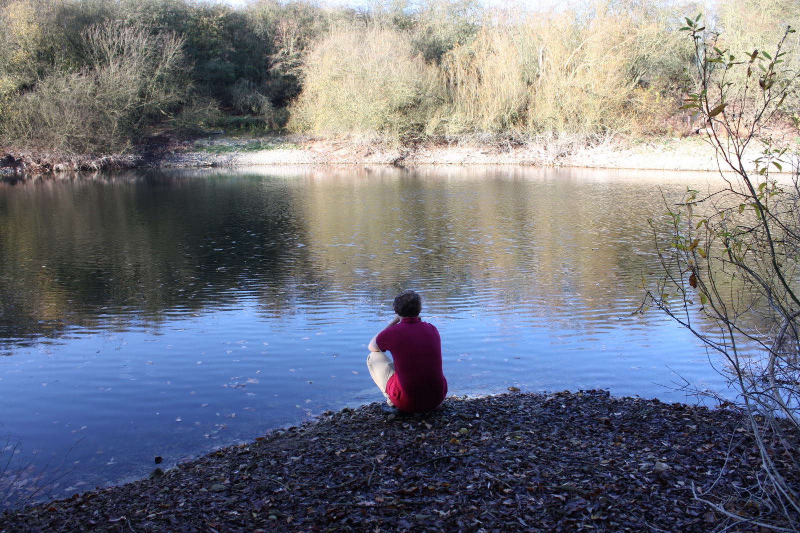
In the third picture on the right we can see Obadiah relaxing with his friends. Here the audience get a glimpse into his social life and see that he hangs out with average looking people (no offence). This gives off the message that he is social and not too different to the average indie-acoustic fan. The background is a tree, yet again showing his country background, showing that he's not urban like most artists currently in the market.

Similar Artists - Look - Joshua Radin

Joshua Radin

Here i'll be looking at images of Joshua Radin and i will pay particular attention to his clothing, style, pictures, poses, sightlines, colours and props.


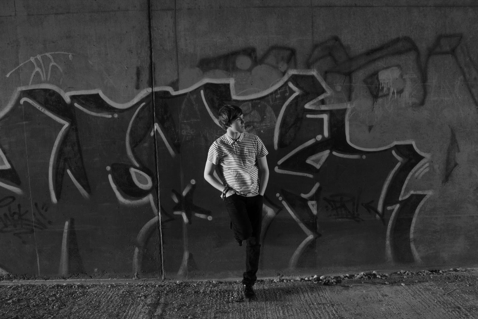
In the picture on the right we see the cover for radin's song Closer. We can see that his clothing is simple, just a plain t-shirt which gives the impression that he's not too bothered by how he looks. We will not be sticking with this idea with our artist, as we want him to look like he has a certain style, but this look was an option that we considered, but we decided against it as it is not the image we want our artist to follow.

His sightline in this picture is looking beyond the camera. This makes the viewer feel like he's in the proccess of making the song, as it doesn't look posed. He uses veyeurism to great affect here. He's allowing the audience to get a glimpse into 'the making of' a Joshua Radin song.

In the second picure we see him performing live. His clothing here is different to the first picture and more like what the look that we're going for with our own artist. The checkered shirt is an option that we plan to be using, it's a common look that you see when looking at typical indie artists.

The third image on the right is one of his album covers. It has a unique style, with the black and white effect, only showing the colour red. This effect  draws the audiences attention the the bucket and spade rather than the artist. This combined with the pose of the artist and his direct sightline, creates the impression of vulnerability. The bucket and spade and the red show his connection with youth which also relates to the album name 'Simple Times' which also makes the audience think of times when they were younger.

His outfit in the third picture show that he does have a certain style. The braces that he's wearing with the top button undone and the messy hair shpw his messy nature. This is common in this genre and we may use it ourselves with our artist.

A common prop in the first two images is the guitar. It is essential that in our advert and our digipack that we have a guitar in the shot. Followers of this genre like to  see the artist actually performing.

Also a common theme is the black and white effect, used in botht he first and third image. This is an effect that we are considering to use for our video and maybe the digipack too.

Ed Sheeran - Lego House

From the statistics you can see Ed Sheeran's fan base is mainly spread across North America, Europe and Australia. The statistics also show to us that the video is most popular with Females between the ages of 13-17 and males of 18-24. This shows to us that young educated citizens are into indie acoustic as they are Ed Sheeran's most popular fans also 48,805 fans have this song in their favourites which shows there is a huge potential market out there for our artist. The video has very few dislike and loads of great comments which shows Ed Sheeran is making his fans happy by producing good music and videos they want to see. The video tells us how many views came through Facebook which is turns out to be loads therefore we would have to market our artists on Facebook to make sure we hit our complete target audience not just most of them.